Showing posts with label watercolour. Show all posts

Monday, 25 April 2022

Little Paintings for my Kickstarter 'The Wind in the Willows' Book Campaign

 I feel like I'm blowng the dust off this blog, polishing my spectacles, and thumbing through its pages to see where I last posted... December 2020?!!! Oh dear. In explanation I use this blog to post my thoughts and process on painting, and Facebook, Instagram and Twitter for promotion. Over the last year and a half I've been so busy, I've barely been able to look around and post something meaningful, until now.

As part of my Kickstarter campaign to gather pre-orders for my fully illustrated edition of 'The Wind in the Willows' (take a look), I have been creating 15 small watercolours for those lucky backers who snapped them up in the first few days of the Kickstarter launch. I also managed to make a time lapse video painting Ratty, start to finish. 


Many people ask me about my technique, hopefully this video will give you some pointers. At the beginning I start with my basic linework (which has been slightly erased with a putty rubber). Then I add an underpainting of cobalt blue and cadmium red mixed together. Those colours create a dull violet, perfect for cast shadows on a warm day (complimentary to yellow ochre). Once the underpainting is dry enough, I add local colours and then start to build up deeper tones and details all over. Lots of work is required on the fur to give Ratty a nice texture, but I have to be careful not to overwork his shirt and trousers, which is easy to do with transparent watercolour. The red chequer for the basket liner is left until last, because I want to build up all the tonal values first and then let it influence the layer of red watercolour. I do this with all patterned fabrics.

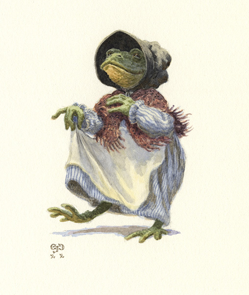
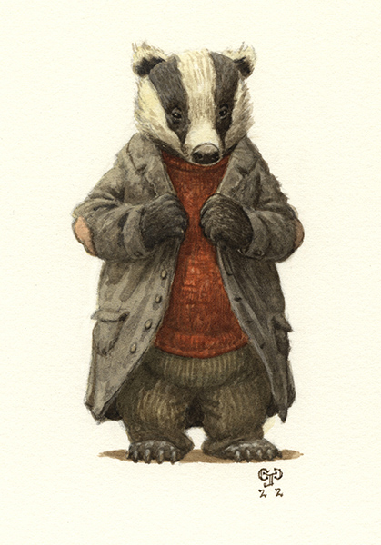
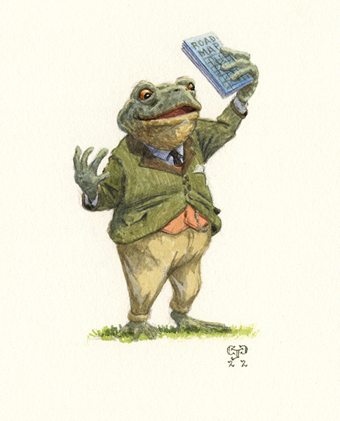
Here are the other character paintings, all taken from scenes in the book:


Tuesday, 22 October 2019

Work In Progress

Rough Drawing - I can't think of a suitable title yet!
I've been so busy I have nearly forgotten about my blog! Hopefully this post will kick me into a blogging gear. As I type I am waiting for this painting to dry. I have applied a mixture of prussian blue and payne's grey on saturated paper in the hope of creating an atmospheric late evening background of fields and trees under a light dusting of snow. The finished scene will have Mole sadly recalling his old subterranean home and how he hasn't seen it for so long. The two friends are making their way back to Ratty's house, late on a winter's day, when Mole suddenly catches the scent of his home and becomes distraught. Ratty consoles Mole and quickly decides to find Mole's house in the hope of cheering him up.

I love sloshing watercolour around...

Wednesday, 12 June 2019

Two Paintings In One

Double Jeopardy
Every now and then I like to create two paintings on the same piece of paper. It saves time, paper and water because I soak my watercolour paper in a water tray before taping it to the board to dry and stretch. It may be a time saver, but working like has risks. I must be very careful to protect the half I am not working on from moisture and paint. Thankfully Scotch Magic Tape is brilliant for masking watercolour paper without overly-damaging the paper underneath. Fortunately the tape also adheres to the plastic sheet I use to mask larger areas, which means I can fix the sheet in place and seal all the edges so there is little chance of water encroaching onto the painting.

This message is not sponsored by Scotch Magic Tape, although I wouldn't mind if it was (they could pay in rolls of tape).

Here are the finished 'The Wind In The Willows' illustrations:
'Walking Through The Village'watercolour and gouache
24 x 31cm
'Heard The News?'
watercolour and gouache
24 x 31cm


Monday, 11 February 2019

Like Summer Tempests Came His Tears

'Like Summer Tempests Came His Tears' watercolour and gouache , 24 x 31cm
Another 'The Wind In The Willows' illustration, finished this morning and shared with the online world! Here Badger gives Toad some stern words, criticising his past behaviour and blaming him for the loss of Toad Hall. However, he also offers hope when he comes to explain there is a secret tunnel into Toad's old residence which they can use to flush out the wicked stoats, ferrets and weasels. Good old Mr Badger, I say!

I had plenty of fun adding the extra details to create a further narrative in the image, such as the oars above the fireplace and the framed map of the river and it's tributaries on the wall. Also, please take the time to read the newspaper headline, which harks back to the adventures of Toad.

There are also cameos for my Grandmother's caddy box on the mantlepiece and the obligatory cornishware mug on the table.

Monday, 21 January 2019

WIP 'The Last Train'

The Last Train WIP

Back to my challenging painting today. Originally I thought I would show the scene, of Toad hitchin' a ride on a steam train, under an overcast sky. For some reason I decided to attempt a cloudy sky at the end of the day, when the Sun is about to drop and blue reflected light is starting to take over just for a brief period until the Sun totally disappears below the horizon. Simple enough, until you factor in the platform lamps, which must be bright enough to stand out against the oncoming gloom but not be so powerful as to outshine the other two natural light sources.

As I said, this one is very challenging but is also an excellent opportunity to learn, which for me is the whole point. So back to it...

Tuesday, 6 November 2018

New Grimm's Fairytales Artwork

A short post for those who have not seen my latest output:
'The Fox and the Cat'
watercolour and gouache
24 x 13cm
'Shoemaking Elves'
watercolour and gouache
24 x 13cm
'The Raven'
watercolour and gouache
24 x 13cm
'The Cat and Mouse In Partnership'
watercolour and gouache
24 x 13cm
Some of you may have spotted these illustrations are all inspired by Grimm's Fairytales. I will be producing more illustrations based on the well-known tales very soon.


Monday, 17 September 2018

The Raven WIP

Sometimes I like to paint two paintings on the same piece of paper. Is it because I enjoy the jeopardy or am I frugal? You decide.

Both of these illustrations are for a small series of Grimm's Fairytales that I am producing. 'The Cat and Mouse in Partnership' on the left, and 'The Raven' on the right.

Monday, 25 June 2018

'Ratty's House'

'Ratty's House'
watercolour and gouache
24 x 31cm
This little 'The Wind in the Willows' illustration was completed Thursday - as hot of the drawing board as I can get. This is what Mole sees when he reaches the riverbank and claps eyes on Ratty for the first time.

I had lots of fun working on the trees, especially flicking masking fluid around to get the speckled bark effect. I was also quite pleased with the water.
Work in progress detail before whiskers and pinstripes.
The pencil rough

Thursday, 31 May 2018

Mr Toad In Court

'Mr Toad In Court'
watercolour and gouache
51 x 39cm
Last week I completed this complicated scene from 'The Wind In The Willows'. Mr Toad has been brought in front of a judge to hear his sentence for stealing a car and driving recklessly.

My rough drawing. Compared with the finished painting you can see I made some changes, especially on the faces.
I followed all the usual procedures on the creation of this illustration. Thumbnails, rough preparatory drawing, transferred pencil onto watercolour paper, sepia underpainting, watercolour work and finally gouache finishing touches. Nothing out of the ordinary. Therefore, in this post, I have chosen to highlight some of the details in the painting that are not immediately obvious, but I feel make a difference in how you read the image.

A spiky friendship
I've 'raised the bar'

Both my wife and myself make cameo appearances in this scene. I appear to have changed profession, and Suzanne now hangs out with hedgehogs.
I detest littering.
The discarded 'Times' newspaper headline reads MR TOAD ON TRIAL. Note the burnt out matches on the table used to light the table candles when the sun drops.

Vicky is not amused.
Queen Victoria is quite shocked at Toad's sentence (or is she showing disapproval?). Also the human and owl judge have their own painted portrait in the corner, just above peeling wallpaper.


Monday, 9 April 2018

She Guarded The Castle


'She Guarded The Castle' watercolour and gouache, 31 x 24cm
Here's something I finished just before the Easter break. This is my first Grimm's fairytale illustration. The scene is taken from 'Jorinda and Joringel' which features a witch who can take the form of an owl and cat. Her abode is a castle in the woods where she captures maidens, turns them into small songbirds and locks them away in cages (can you spot the key?).

For reference, I was fortunate enough to have a collection of woodland photos I had taken in the rain this winter. The castle is based on Helen's Tower in Northern Ireland, apparently you can stay there! As for the owl, I found a collection of shots on google and took bits from each to fashion my own bird perched on a branch.


Depicting mist can be a tricky business, keeping an eye on distance from the viewer juxtaposed with visible levels of detail can sometimes lead to overworking areas and underworking others. This in turn can ruin the atmospheric perspective I'm hoping to achieve. In the end I washed out lots of detail in the castle and trees, and chose to only fully define the windows and middle-ground tree branches

As I look back on the painting now, I'm very happy with the final result. I tried to imbue the painting with a dark foreboding presence without being a cliché. I think this image would work well in some of the later (and darker) Harry Potter books and also have a similar atmosphere.

Saturday, 10 March 2018

My thoughts On 'Supper Arrives'

'Supper Arrives' watercolour and gouache, 31 x 40cm
This is my latest painting for Galerie Daniel Maghen. I finished it last Tuesday, and I'm not sure exactly how long it took to complete other than I felt I spent longer on this piece than anticipated. 
 
The scene is taken from 'The Wind In The Willows', when the carol singing mice are invited into Mole's house for supper. Soon they realise Mole is low on food, so two young mice are sent out with a basket to fetch more vittles for their evening feast. Here you can see the mice have returned and their fellow creatures are excitedly dishing out the basket's contents.
 
Normally I'm very confident when it comes to these cosy interior scenes, however this time I really struggled to keep everything warm and slightly gloomy (if that's the right word), especially when I was painting the blue welsh dresser. If you're not careful, a blue dresser can swiftly turn green when painting in watercolour.
 
The gouache highlights certainly helped to sharpen well lit edges, such as an ear, whisker or ceramic mug. The candlelight was deliberately kept to watercolour and using the white of the paper to create a bright glow. If you try to introduce gouache into something so bright it can look a bit flat and even grey as the opague paint doesn't always reflect natural light as effectively as watercolour paper.
 
Out of interest, most of the items in the kitchen are taken from Avebury Manor in Wiltshire. The kitchen table, dresser and stove are very similar to the ones in this painting. It's always much easier to draw something straight from reality than invent your own objects, and quite often you spot something that you would never have imagined too.


Monday, 1 January 2018

25% Off All Signed Limited Editions

https://www.chris-dunn.co.uk/shop
Happy New Year! To celebrate I'm having a January sale with 25% off all my signed limited edition prints. Visit my online shop to see what is available. Thank you to those of you who have already picked up a print.

In the meantime, here's some new artwork I finished last week:
'Leaving The Wild Wood' watercolour and gouache, 24 x 31cm

Monday, 18 September 2017

Peacock Arts Trail 2017


Open Studios In North West Wiltshire
30 Sept - 8 Oct
peacockartstrail.co.uk


I will be sharing a space with the ceramic artist Claire Baker for this year’s Peacock Arts Trail, and it would be wonderful to see you there. I will be exhibiting some originals and a large selection of signed limited edition prints.

Venue: The Plough, Chapel Knapp, Gastard, Corsham, Wilts SN13 9PT
Directions: At the top of Velley Hill in Gastard (B3353) is a sign for Boyds farm, turn into lane and the Plough is immediately on the left.

Opening:
Both Weekends – 10 – 5
Monday 2 October – 10 – 5
Tuesday 3 October – 10 – 5
Wednesday 4 October – Closed
Thursday 5 October – 10 – 5
Friday 6 October – 10 – 5

Parking available.

All visitors will be given the opportunity to enter a free prize draw to win a signed limited edition print of their choice!!

Thursday, 9 February 2017

Paisley Rabbit Cover, Leaf By Leaf (Part 2)

Now for the second instalment of 'showing you how I created the book cover artwork for Paisley Rabbit And The Treehouse Contest.' You can see the first part of this post here.

I left you poised to start laying in the basic colours for Paisley Rabbit and the flycatcher birds. Below you can see that stage completed. I tend to take these photos at the end of a day's painting, not stage-by-stage, so in this shot you can also see I have started to define the creeping ivy.
White spaces filled in and looking vaguely like animals.
The following day I removed all the masking fluid, leaving some very pale speckling across the bark. I decided to do that now so I could keep on adding paint to the branches, and gradually soften and darken those areas that had previously been protected by masking fluid. Sometimes I take away the mask too early and there is not much difference in tone between the applications of watercolour. Then other times, I remove the mask too late and it looks like somebody has sneezed all over the painting!
Mask off - may the true painting identify itself.
By this stage I was in the usual tonal/contrast dilemma that all my paintings go through. I wanted to make sure the top canopy was suitably dark enough to make centre strong in contrast. The left side of Paisley is lit, placing the other side of the ivy and branch in relative darkness. I really wanted to push that 3D contrast by matching it to the dark tones in the canopy.
Sloshing lots of paint with a big brush.
I was really piling on the paint, keeping things loose with the hope I could define the leaves at a later time.
Leaves become more defined.
Above you can see how I managed to outline individual leaves, by scrubbing back paint and creating contrasting hard edges where I could, particularly in the ivy. By now I was beginning to think this painting would never end.
Darker branches to create a separation between foreground and background
Finally I'm towards the end of the watercolour (and my wits) here. I was concerned the image would be a full frontal assault of green, with very little breathing space. How could I solve that problem? By adding more green of course! The logic was to darken the main branch of the tree, in the hope of pushing back the leaves in the background. I think it worked. You can see the finished painting below and really get an understanding of how much darker the canopy and main branch have become.

You can also spot all the little bits of pastel cerulean blue gouache and yellow ochre I used to further define the leaves and create a little bit of cool reflected light in the shaded areas.
Paisley Rabbit Book Cover
Watercolour and Gouache
42 x 55cm
Now the painting is finished, the next step is to decide on a suitable layout for the text. Once that is completed I will of course dutifully post the fruits of my labour on this 'ere blog. Until that time, take care and don't decide to paint an overly-complicated series of branches and leaves, unless you wish to loose your sanity!

Sunday, 15 January 2017

Paisley Rabbit Cover, Leaf By Leaf (Part 1)

The approved rough design for the book cover
Last week I started work on the final painting for the book cover of Paisley Rabbit and the Treehouse Contest. Naturally this is one of, possibly the most important illustrations for the book, so I decided to enlarge the painting even further than normal to give me maximum room to create a really detailed and luscious watercolour illustration. Now, as I am still in the process of throwing paint at paper, there is no guarantee the finished piece will be luscious, at least I have given myself plenty of room to succeed (or fail).

As I type this, I'm probably not even halfway through the painting so I could be documenting a monumental flop. However I'm going to risk airing my underwear in public and if you don't like what you see, you can always 'unfollow' me and set fire to your PC, laptop, or whatever device you view the great worldwide web on.
Exhibit A - fuzzy photo of fuzzy pencil line
Above is the line drawing on stretched watercolour paper (Arches HP). Before I begin painting, I always email an image of the linework to my client to make sure no major changes are needed and I am good to proceed with colour. After all, pencil is much easier to erase than paint!

This linework is slightly different than normal in that I have been very selective in what I choose to outline. Normally I would treat the whole area of the image the same and outline all the aspects of the composition. However if I were to be so thorough and draw every single leaf, you can imagine how much longer the process would take. Instead I opted to draw the leaves that were pivotal to the cover (such as those interacting with Paisley Rabbit and where the title box would appear) and leave space for the others that would gradually appear organically from the shapes I created with the watercolour.
Wet-in-wet watercolour fun
Once the pencil drawing was approved, I began wetting the whole surface of the painting and then grabbed a large flat brush and started to slap lots of Prussian blue, cobalt blue, cadmium yellow and lemon yellow around the paper. This is my favourite stage in most paintings as I start to see things emerge as the wet colours interact. I juggle between what naturally happens with the paint and how my reference is telling me what the tree should look like.
During a reference trip in October I found this great oak near my home
This ivy was climbing up a gatehouse at Stourhead. I took this photo nearly 7 years ago!

Blocking in - choosing what to put in and 'leave' out.
After the wet-in-wet stage, I dried the paper with a hair dryer and started to block in the basic shapes and colours for the whole image. For this I used the same colours and also scrubbed out lots of paint too, especially where the blue sky was too dark and thus competing with the leaves for attention (I should have refrained from using cobalt blue!). I'm very concerned about creating depth in this image as the composition is very cropped with a very shallow depth of field.

The next job is to block in the basic colours for Paisley Rabbit and the birds (flycatchers). Once they are reasonably defined, I will return to the tree and really work hard on developing darker tones and form in the branches and upper leaves.

Until next time...