At a want for a mangle printing press I tested out a theory today that I've had swilling about in my barren brain after seeing Ridley Scott's Robin Hood. For the moment I'm going to keep quiet about the process but I can show you the results.
There are lots of elements that need revising but overall I'm quite pleased with the final outcome. Unfortunately there was a good amount of tweaking done on photoshop which can take away from the textured plate tone so somehow I have to get the image near finished before digitizing.
Right I'm off to look up the PPPs (printing press prices) :-D
Tuesday, 15 February 2011
More roundtable artwork...
I was fortunate enough to work on another article in the same magazine issue 'Euro Humpty Dumpty' featured in. Top you can see how the portraits were laid out in MT and above is my favourite portrait so far, he's called Steve Walters.
In comparison to my earlier attempt at the roundtable feature this one was much more successful. I can categorically put this down to better reference photos. I don't know if a professional photographer was used during the session but it looked to me as though a quality camera took the photos rather than a mobile phone. Previously I used reference from a mobile which was a bit of a struggle, the contrasts were poor and often a lot of facial features were blurred.
See Dan dos Santos' post on Muddy Colors about the benefits of good reference models.
Wednesday, 9 February 2011
Humpty Dumpty Euro final artwork
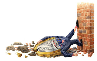
Here is the final coloured artwork that was worked up from the roughs in my previous post. I was up against it during the whole process for these three illustrations, so there are a few things (albeit small things) in each illos that scream 'YOU COULD HAVE DONE BETTER!' but on the plus side at least I can paint a nice brick wall under pressure.
The main illustration at the top was the last thing I worked on - save the best till last and all that. I decided early on, before adding watercolour, to brush in a burnt sienna acrylic underpainting to give the background a warm haze that would react well with ultramarine washes in the shadows. This technique is something I have been developing and hoping to incorporate more into further work. For the reflected light on the windows I used a pale mixture of cerulean and titanium white gouache.
Subscribe to:
Comments (Atom)


